Work / Tractor Bev. Co.
Case 06 / 10

01
savor the sun
Photo + Video Production / Art Direction
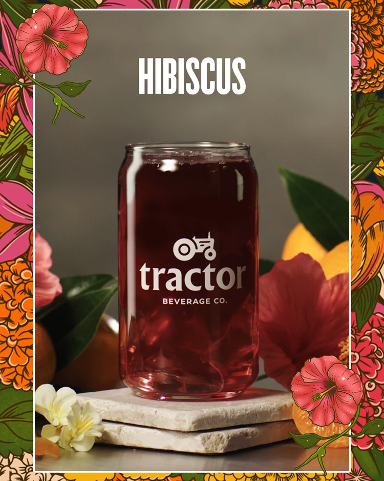
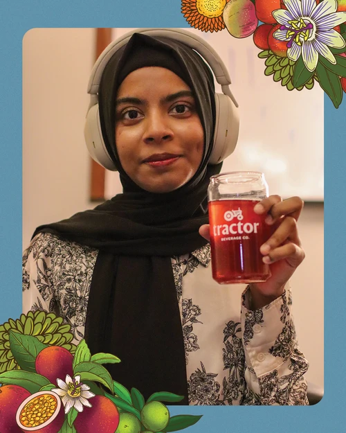
Tractor had no visual identity to pull from. As art director on the campaign, I led pre-production creative direction across three original content series — defining the visual world, building flavor-specific briefs, and setting the aesthetic logic the production team shot against.
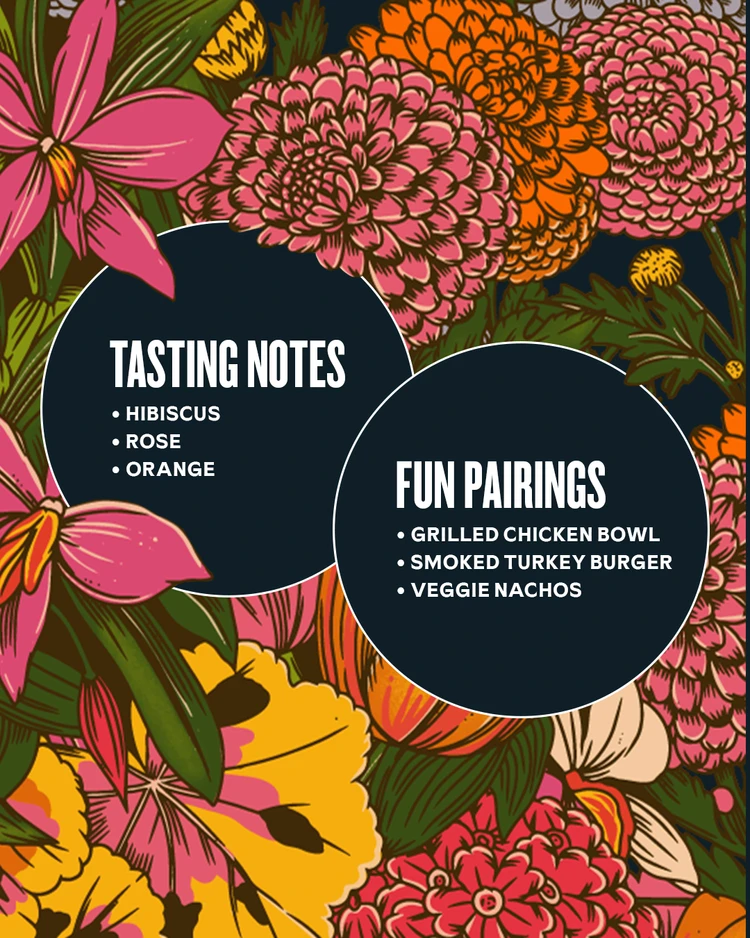
The moodboard I developed anchored the entire shoot: late afternoon warmth, materials close to the earth, raw staging platforms in concrete, pine, and sandstone, with each flavor mapped to its own destination and visual vibe. That direction held across 11 videos and a b-roll library, giving the brand a full content ecosystem from a single day of production.
DROP IMAGE — New favorite read, 9:16
look & feel
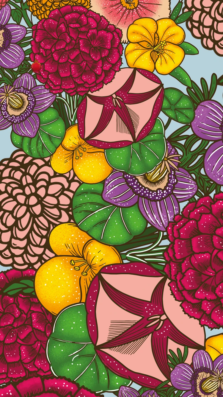
photography into graphics.
The shoot photography became the raw material for a full graphic system — overlays, lockups, and campaign assets that extended the visual world into paid placements without losing the warmth of the original stills.
one shoot. months of content. every asset traceable to a single visual point of view.
02
evergreen social
Art Direction / Content System
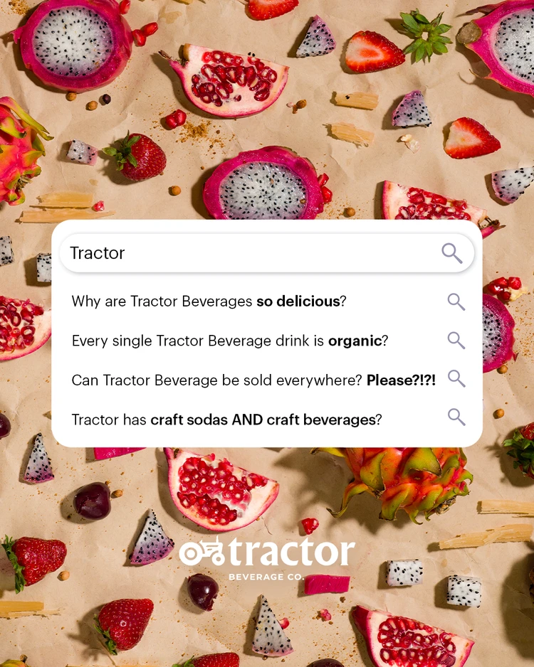
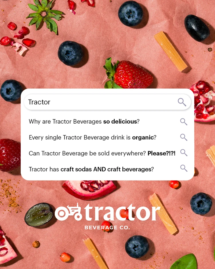
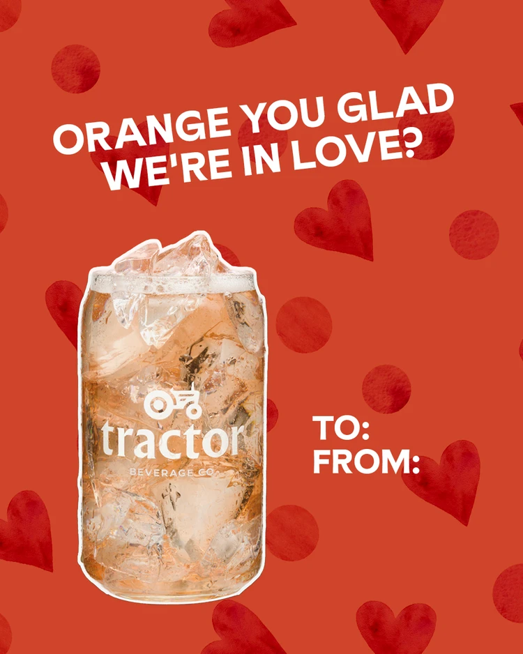
Beyond the shoot, I led ideation and art direction for the ongoing social content calendar — developing a playful, human tone that made Tractor feel approachable without losing flavor. The voice leaned into the brand’s farm-to-fountain story: specific, punny, never generic.
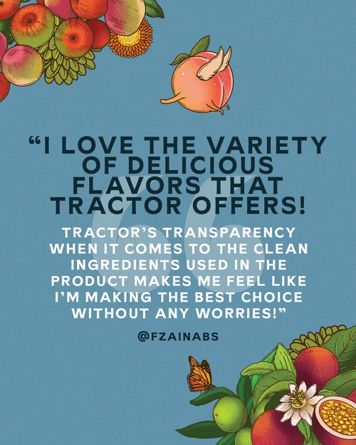
The tone worked. Comment sections filled with real customer testimonials and unprompted brand loyalty — the kind of engagement that doesn’t happen when the copy sounds like a brand.


1.5B+
Impressions
across organic and paid
50M+
People Reached
via paid campaigns
915K
Link Clicks
across organic + paid social
The Throughline
made a product people couldn’t buy in stores feel worth seeking out anyway.
an invisible product needs a face.
Most people had never seen Tractor outside a fountain nozzle. The photography gave the brand a physical world — warmth, texture, color — that existed nowhere else.
one shoot, months of content.
Savor the Sun was designed as a content engine, not a campaign. Still photography, motion frames, and graphic assets all came from the same setups — so the visual consistency held across the calendar without re-shooting.
tone is brand identity when there is no shelf.
The playful, punny voice wasn’t decoration. For a brand with no retail presence, the way it spoke in comment sections was the only direct relationship it had with customers. The testimonials people left proved that voice landed.
