Work / Disney: Freeform
Case 07 / 10

built from zero. made it feel like it was always there.
01
the work.
Illustration, Social Design, Art Direction
Warm, modern, inclusive, and fast. That was the brief. I developed an illustration direction built around expressive characters, bold color, and clear storytelling that could flex across very different subjects — celebration, advocacy, environmental awareness — without losing a consistent voice.
Each piece was designed for feed-first consumption: readable at thumbnail size, layered enough to reward a tap.
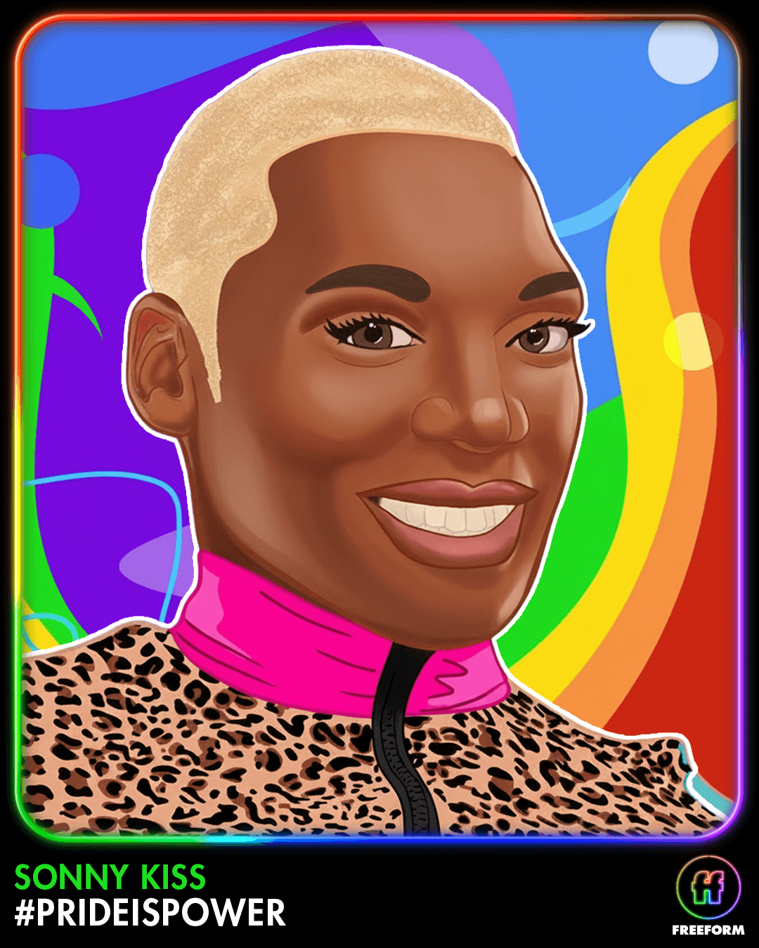
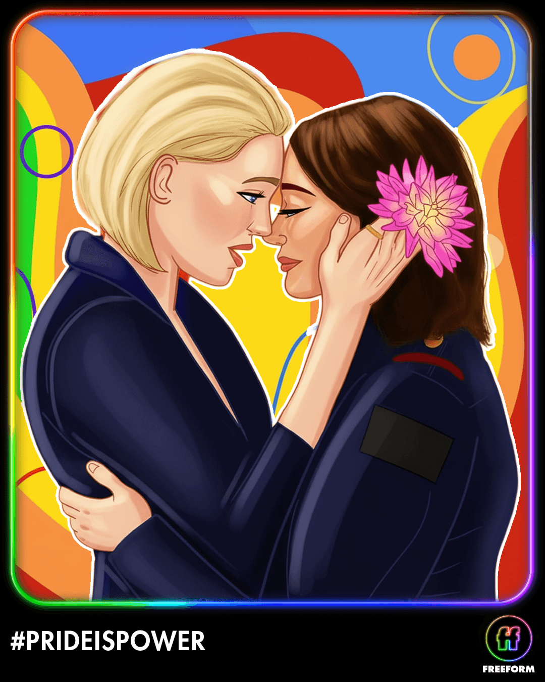
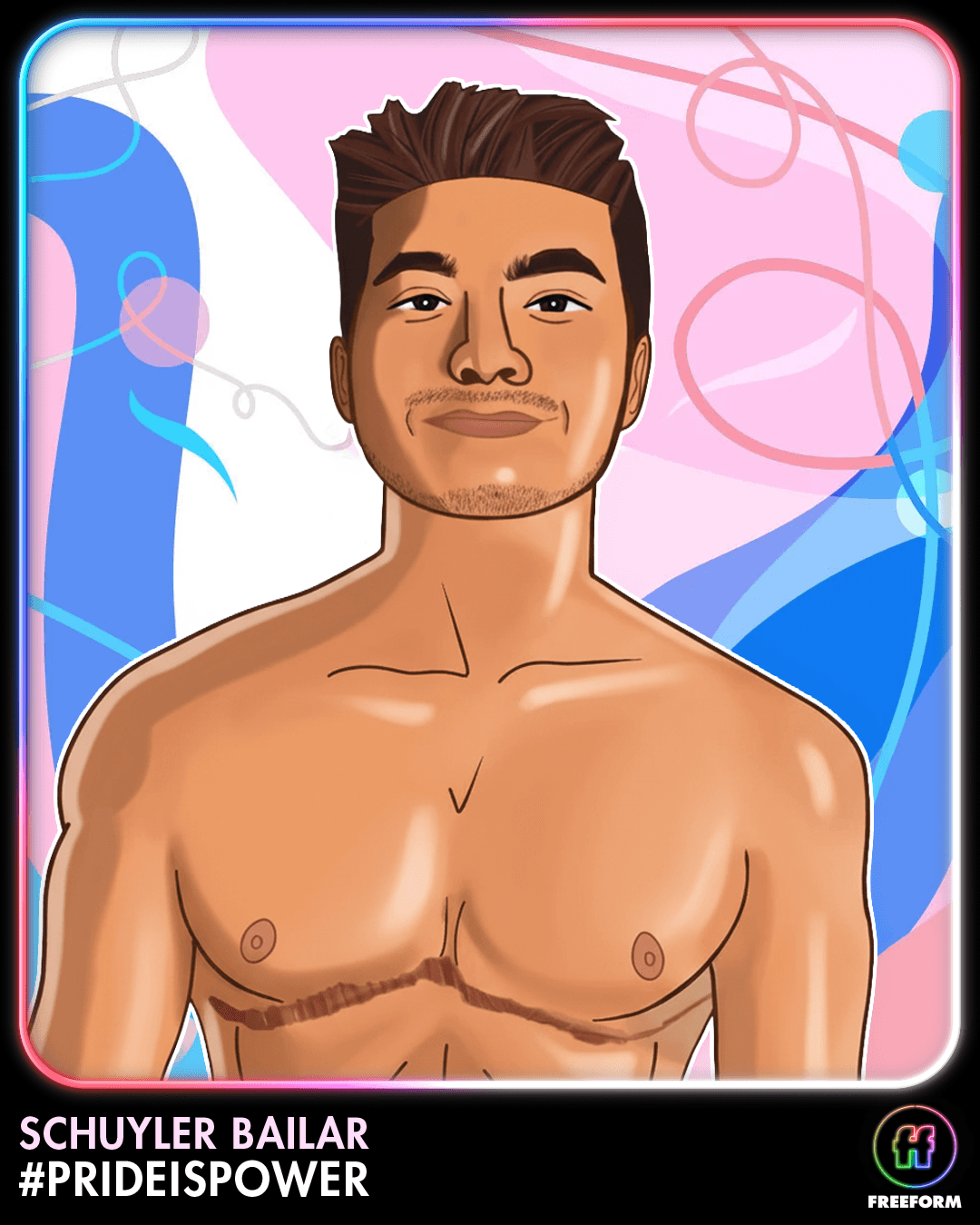
look & feel
characters, color, clarity.
The illustration system uses expressive character work as its anchor. Color is bold and non-literal — chosen for mood and readability in a crowded feed, not photorealism. Every asset prioritizes clarity at small sizes: the idea reads before you stop scrolling.
02
cultural moments.
Campaign Art Direction, Social Content
Pride, environmental awareness, community celebration. Freeform needed to show up with clarity and intention in moments that mattered to their audience. The illustration format gave each campaign a warmth and specificity that stock photography never could.
The constraint was consistency: every asset needed to feel like it came from the same hand, regardless of how different the topic.
every topic, one voice.



THE THROUGHLINE
craft work at a name that earns its place on any reel.
the name is the proof.
Disney’s brand standards are strict. Getting illustrated work approved and published here means the aesthetic earned its place, not just cleared a checklist.
no precedent is a creative constraint.
No prior examples meant the first piece defined the standard. Building a visual language from nothing and keeping it consistent across a full year of content is the job, and this is proof it’s been done.
feed-first is a discipline.
Social illustration that reads at thumbnail size, holds up on tap, and stays on-brand across wildly different topics is a harder problem than it looks. That’s what this work solved.
